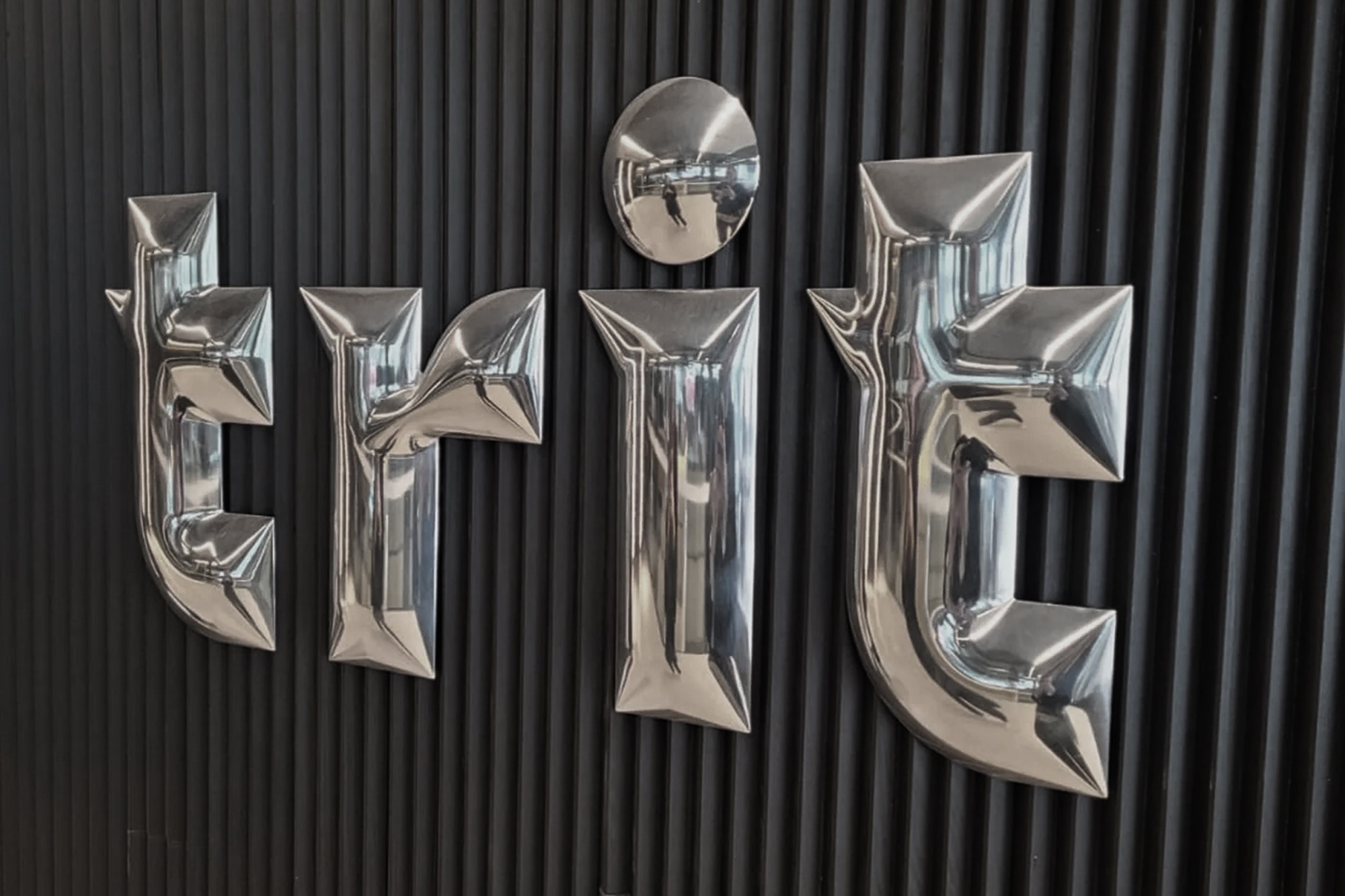
Trit required a branding overhaul from their previous image ‘click on furniture’. The challenge was to create a brand that would completely transform the perspective of the furniture business from commercial replica imports to boutique designer furniture offerings. Trit has 5 stores across Australia.
We began by collaborating with the company on naming and tag-lines as this was the first step into building a new vision for the overall brand. The main guidelines we put on ourselves as restrictions was to keep the name between 4-5 letters long that had a tagline that was found to be more associated in fashion and at the higher end designer spectrum. This led to TRIT letters formation deriving from the 1st letter of the owners names and their children. We then played with the ordering of the letters that would appear most balanced visually and also what we belived rolled most easily off the tounge.
We began the creation of custom type that we believed needed to have the sense of being grounded and solid. This felt like the best way to convey the quality and sturdiness of the furniture found across TRIT’s collection. We played with the spacing of the type and opted to have this closely together. This emphasised the closeness of family and visually creating shapes in the voids of the type which resembled silhouettes of furniture and wares.
The colours and finishings were a prominent aspect from very early on in the process, we knew that we needed to find a sweet spot between cost and quality and had to be very mindful of the execution to portray a certain level of quality. The colours were drawn from warmth and approachability we needed to look at this from a different angle to allow us to still be bold with strong colours such as red but juxtaposing this with mustard and black to bring the overall tone down to an inviting warm space that wasn’t jarring.
