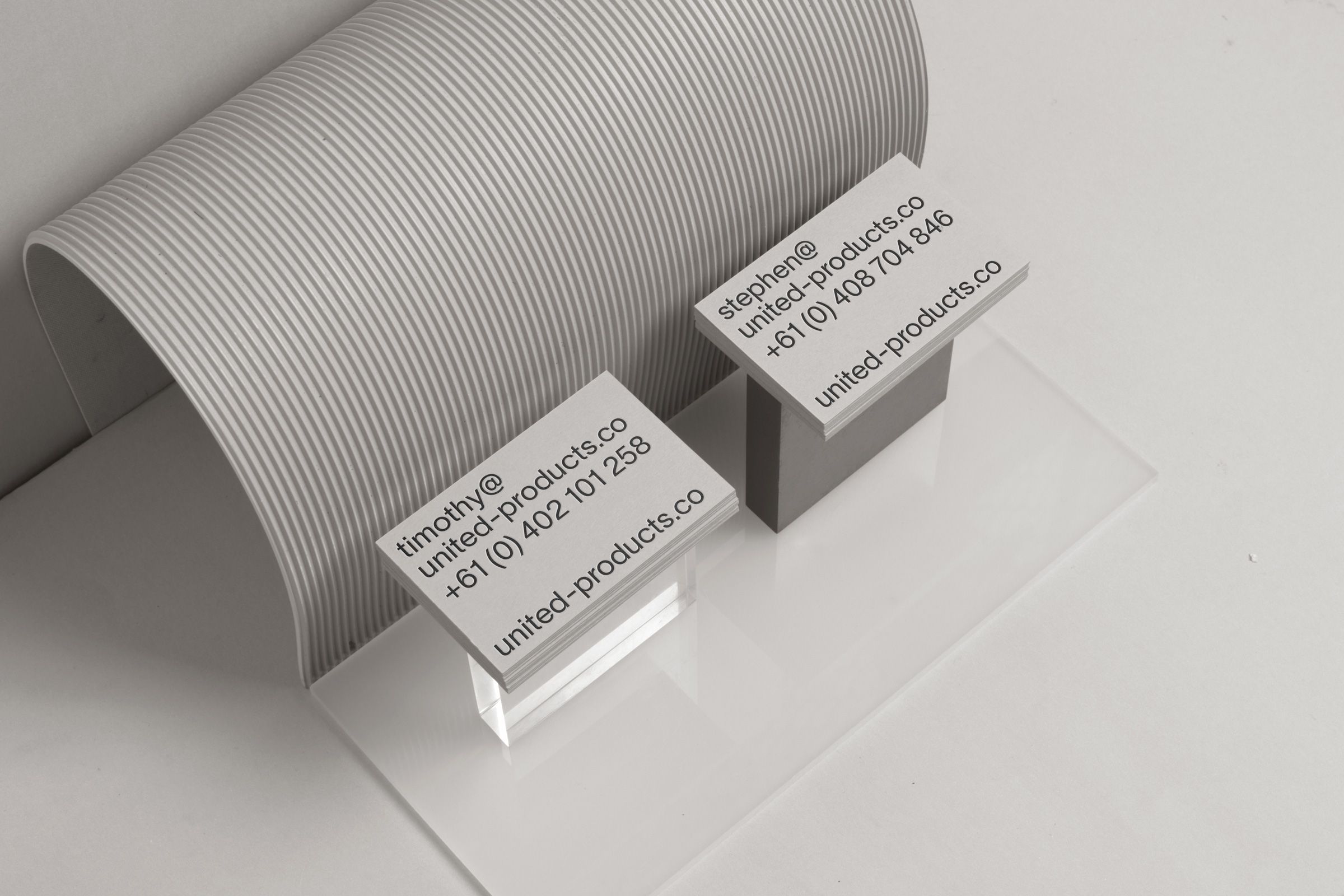
Identity Design for United Products. We were approached by United Products to refresh their brand identity and collateral. This required typeface exploration, animation, printed and digital documents that would unify the vision and aesthetic that United Products needed to portray.
The concept was to find the balance between sleek and playful. The documentation needed to be practical in its legibility whilst adding a little bit of personality and traits the various designers express through their work.
We started by creating a wave animation that was fitting to bathroom products. This was made to move like water but textured like liquified porcelain.
Various deliverables were created and carried through the wave as a recognisable element. We rolled this element throughout the branding, accompanied by the use of layout and typography which gave a strong sense of weight to the overall execution of the brand values.
